Had some free time to play around with some of my photos to see if I can make it look better than before. What do you think? Is the original better or does the new version have more ohmph in it?
#1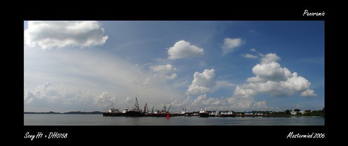
This was part of my old banner series of the sea view at Pasir Ris park. Several shots stitched together taken with my H1. The sky looks a bit flat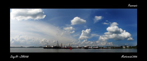
Did some burning to the midtones and adjusted the colour curve. The clouds now seem to be popping out and the sky prettier, isn't it?
#2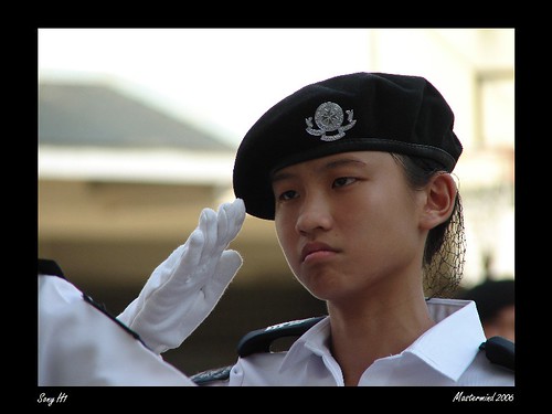
From the SJAB parade. I liked the angle of the shot but the challenging conditions meant I burnt the background but the faces were still a tad underexposed.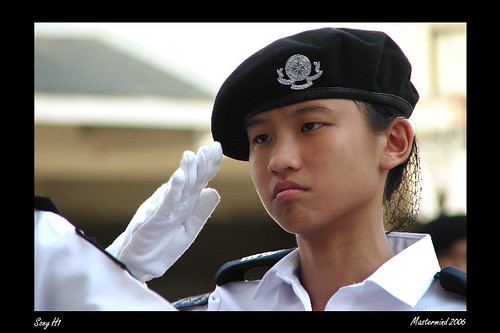
Cropped some of the burnt skies to give a 3 by 2 aspect ratio (for printing of 4R too) and brighten up the faces.
#3
#4
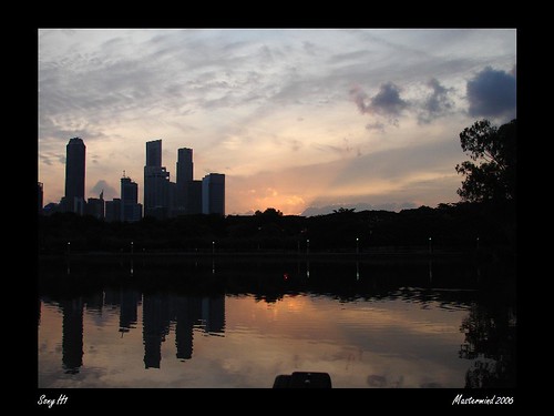
This sunset shot is from the fireworks festival period too. Thought I could add more drama mama to the shot..
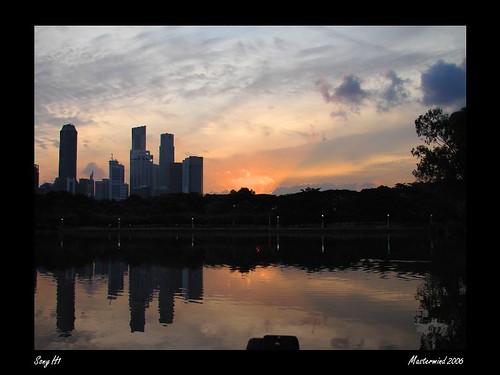
Here's a redder, or rather, orangy skies. Brighten up the buildings a bit too. Could be better but my basic skills could only do so much..
#5
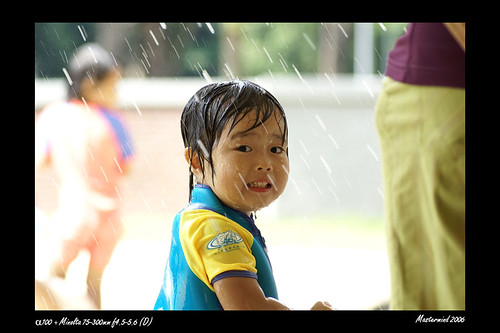
Again difficult lighting conditions caused the background to be burnt. But it opens up opportunity to try something different in my editing...
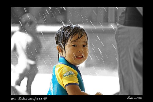
Might as well desaturate and burn all the highlights of the background stuff to make xiaobudian stand out even more. At full size, can even see the water trail on her face. Cool!
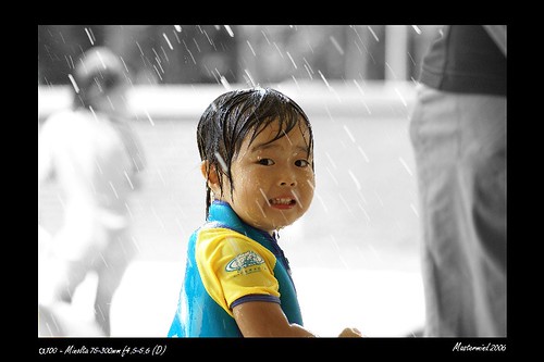
Oh.. left out this one in the last update. Another version of xiaobudian's photo. This one is just desaturation
Well.. hope ya like what you see here...
2 more days to term 4..
singapore photoshop photoblog sony a100 alpha dsc h1
Labels: Blog - Photography


